
12 Principles of Animation
The Illusion of Life: Disney Animation 一书中发表了动画的十二个原则 (12 Principles of Animation) 。这些原则很贴地气,让我们在现实生活中感受动画带来的真实。
一、挤压和拉伸 (Squash and stretch)
挤压和拉伸 (Squash and stretch)
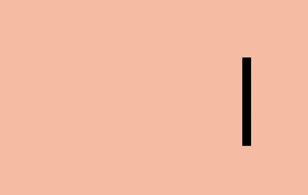
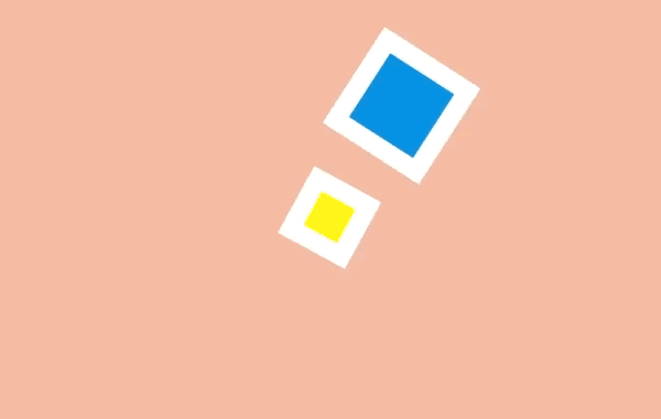
这是物体存在质量且运动时质量保持不变的概念。当一个球在弹跳时,碰击到地面会变扁,恢复的时间会越来越短。创建对象的时候最有用的方法是参照实物,比如人、时钟和弹性球。当它和网页元件一起工作时可能会忽略这个原则。DOM 对象不一定和实物相关,它会按需要在屏幕上缩放。例如,一个按钮会变大并变成一个信息框,或者错误信息会出现和消失。尽管如此,挤压和伸缩效果可以为一个对象增加实物的感觉。甚至一些形状上的小变化就可以创造出细微但抢眼的效果。
<article class="principle one">
    <div class="shape"></div>
    <div class="surface"></div>
</article>
body {
 margin: 0;
 background: #e9b59f;
 font-family: HelveticaNeue, Arial, Sans-serif;
 color: #fff;
}

.principle {
 width: 100%;
 height: 100vh;
 position: relative;
}

.shape {
 background: #2d97db;
 border: 1em solid #fff;
 width: 4em;
 height: 4em;
 position: absolute;
 top: calc(50% - 2em);
 left: calc(50% - 2em);
}

.one .shape {
  animation: one 4s infinite ease-out;
}

.one .surface {
  background: #000;
  height: 10em;
  width: 1em;
  position: absolute;
  top: calc(50% - 4em);
  left: calc(50% + 10em);
}

@keyframes one {
  0%, 15% {
    opacity: 0;
  }
  15%, 25% {
    transform: none;
    animation-timing-function: cubic-bezier(1,-1.92,.95,.89);
    width: 4em;
    height: 4em;
    top: calc(50% - 2em);
    left: calc(50% - 2em);
    opacity: 1;
  }
  35%, 45% {
    transform: translateX(8em);
    height: 6em;
    width: 2em;
    top: calc(50% - 3em);
    animation-timing-function: linear;
    opacity: 1;
  }
  70%, 100% {
    transform: translateX(8em) translateY(5em);
    height: 6em;
    width: 2em;
    top: calc(50% - 3em);
    opacity: 0;
  }
}
二、预备动作 (Anticipation)
预备动作 (Anticipation)
运动不倾向于突然发生。在现实生活中,无论是一个球在掉到桌子前就开始滚动,或是一个人屈膝准备起跳,运动通常有着某种事先的累积。我们能用它去让我们的过渡动画显得更逼真。预备动作可以是一个细微的反弹,帮人们理解什么对象将在屏幕中发生变化并留下痕迹。例如,悬停在一个元件上时可以在它变大前稍微缩小,在初始列表中添加额外的条目来介绍其它条目的移除方法。
<article class="principle two">
    <div class="shape"></div>
    <div class="surface"></div>
  </article>
.two .shape {
  animation: two 5s infinite ease-out;
  transform-origin: 50% 7em;
}

.two .surface {
  background: #000;
  width: 8em;
  height: 1em;
  position: absolute;
  top: calc(50% + 4em);
  left: calc(50% - 3em);
}

@keyframes two {
  0%, 15% {
    opacity: 0;
    transform: none;
  }
  15%, 25% {
    opacity: 1;
    transform: none;
    animation-timing-function: cubic-bezier(.5,.05,.91,.47);
  }
  28%, 38% {
    transform: translateX(-2em);
  }
  40%, 45% {
    transform: translateX(-4em);
  }
  50%, 52% {
    transform: translateX(-4em) rotateZ(-20deg);
  }
  70%, 75% {
    transform: translateX(-4em) rotateZ(-10deg);
  }
  78% {
    transform: translateX(-4em) rotateZ(-24deg);
    opacity: 1;
  }
  86%, 100% {
    transform: translateX(-6em) translateY(4em) rotateZ(-90deg);
    opacity: 0;
  }
}
三、演出布局 (Staging)
演出布局 (Staging)
演出布局是确保对象在场景中得以聚焦,让场景中的其它对象和视觉在主动画发生的地方让位。这意味着要么把主动画放到突出的位置,要么模糊其它元件来让用户专注于看他们需要看的东西。在网页方面,一种方法是用 model 覆盖在某些内容上。在现有页面添加一个遮罩并把那些主要关注的内容前置展示。另一种方法是用动作。当很多对象在运动,你很难知道哪些值得关注。如果其它所有的动作停止,只留一个在运动,即使动得很微弱,这都可以让对象更容易被察觉。还有一种方法是做一个晃动和闪烁的按钮来简单地建议用户比如他们可能要保存文档。屏幕保持静态,所以再细微的动作也会突显出来。
<article class="principle three">
    <div class="shape a"></div>
    <div class="shape b"></div>
    <div class="shape c"></div>
  </article>
.three .shape.a {
  transform: translateX(-12em);
}

.three .shape.c {
  transform: translateX(12em);
}

.three .shape.b {
  animation: three 5s infinite ease-out;
  transform-origin: 0 6em;
}

.three .shape.a, .three .shape.c {
  animation: threeb 5s infinite linear;
}

@keyframes three {
  0%, 10% {
    transform: none;
    animation-timing-function: cubic-bezier(.57,-0.5,.43,1.53);
  }
  26%, 30% {
    transform: rotateZ(-40deg);
  }
  32.5% {
    transform: rotateZ(-38deg);
  }
  35% {
    transform: rotateZ(-42deg);
  }
  37.5% {
    transform: rotateZ(-38deg);
  }
  40% {
    transform: rotateZ(-40deg);
  }
  42.5% {
    transform: rotateZ(-38deg);
  }
  45% {
    transform: rotateZ(-42deg);
  }
  47.5% {
    transform: rotateZ(-38deg);
    animation-timing-function: cubic-bezier(.57,-0.5,.43,1.53);
  }
  58%, 100% {
    transform: none;
  }
}

@keyframes threeb {
  0%, 20% {
    filter: none;
  }
  40%, 50% {
    filter: blur(5px);
  }
  65%, 100% {
    filter: none;
  }
}
四、连续运动和姿态对应 (Straight-Ahead Action and Pose-to-Pose)

连续运动和姿态对应 (Straight-Ahead Action and Pose-to-Pose)
连续运动是绘制动画的每一帧,姿态对应是通常由一个 assistant 在定义一系列关键帧后填充间隔。大多数网页动画用的是姿态对应:关键帧之间的过渡可以通过浏览器在每个关键帧之间的插入尽可能多的帧使动画流畅。有一个例外是定时功能 step。通过这个功能,浏览器 “steps” 可以把尽可能多的无序帧串清晰。你可以用这种方式绘制一系列图片并让浏览器按顺序显示出来,这开创了一种逐帧动画的风格。
<article class="principle four">
    <div class="shape a"></div>
    <div class="shape b"></div>
  </article>
.four .shape.a {
    left: calc(50% - 8em);
    animation: four 6s infinite cubic-bezier(.57,-0.5,.43,1.53);
}

.four .shape.b {
  left: calc(50% + 8em);
  animation: four 6s infinite steps(1);
}

@keyframes four {
  0%, 10% {
    transform: none;
  }
  26%, 30% {
    transform: rotateZ(-45deg) scale(1.25);
  }
  40% {
    transform: rotateZ(-45deg) translate(2em, -2em) scale(1.8);
  }
  50%, 75% {
    transform: rotateZ(-45deg) scale(1.1);
  }
  90%, 100% {
    transform: none;
  }
}
五、跟随和重叠动作 (Follow Through and Overlapping Action)

跟随和重叠动作 (Follow Through and Overlapping Action)
事情并不总在同一时间发生。当一辆车从急刹到停下,车子会向前倾、有烟从轮胎冒出来、车里的司机继续向前冲。这些细节是跟随和重叠动作的例子。它们在网页中能被用作帮助强调什么东西被停止,并不会被遗忘。例如一个条目可能在滑动时稍微滑远了些,但它自己会纠正到正确位置。要创造一个重叠动作的感觉,我们可以让元件以稍微不同的速度移动到每处。这是一种在 iOS 系统的视窗 过渡中被运用得很好的方法。一些按钮和元件以不同速率运动,整体效果会比全部东西以相同速率运动要更逼真,并留出时间让访客去适当理解变化。在网页方面,这可能意味着让过渡或动画的效果以不同速度来运行。
 <article class="principle five">
    <div class="shape-container">
      <div class="shape"></div>
    </div>
  </article>
.five .shape {
  animation: five 4s infinite cubic-bezier(.64,-0.36,.1,1);
  position: relative;
  left: auto;
  top: auto;
}

.five .shape-container {
  animation: five-container 4s infinite cubic-bezier(.64,-0.36,.1,2);
  position: absolute;
  left: calc(50% - 4em);
  top: calc(50% - 4em);
}

@keyframes five {
  0%, 15% {
    opacity: 0;
    transform: translateX(-12em);
  }
  15%, 25% {
    transform: translateX(-12em);
    opacity: 1;
  }
  85%, 90% {
    transform: translateX(12em);
    opacity: 1;
  }
  100% {
    transform: translateX(12em);
    opacity: 0;
  }
}

@keyframes five-container {
  0%, 35% {
    transform: none;
  }
  50%, 60% {
    transform: skewX(20deg);
  }
  90%, 100% {
    transform: none;
  }
}
六、缓入缓出 (Slow In and Slow Out)

缓入缓出 (Slow In and Slow Out)
对象很少从静止状态一下子加速到最大速度,它们往往是逐步加速并在停止前变慢。没有加速和减速,动画感觉就像机器人。在 CSS 方面,缓入缓出很容易被理解,在一个动画过程中计时功能是一种描述变化速率的方式。使用计时功能,动画可以由慢加速 (ease-in)、由快减速 (ease-out),或者用贝塞尔曲线做出更复杂的效果。
 <article class="principle six">
    <div class="shape a"></div>
  </article>
.six .shape {
  animation: six 3s infinite cubic-bezier(0.5,0,0.5,1);
}

@keyframes six {
  0%, 5% {
    transform: translate(-12em);
  }
  45%, 55% {
    transform: translate(12em);
  }
  95%, 100% {
    transform: translate(-12em);
  }
}
七、弧线运动 (Arc)

弧线运动 (Arc)
虽然对象是更逼真了,当它们遵循「缓入缓出」的时候它们很少沿直线运动——它们倾向于沿弧线运动。我们有几种 CSS 的方式来实现弧线运动。一种是结合多个动画,比如在弹力球动画里,可以让球上下移动的同时让它右移,这时候球的显示效果就是沿弧线运动。
弧线运动 (Arc)
另外一种是旋转元件,我们可以设置一个在对象之外的原点来作为它的旋转中心。当我们旋转这个对象,它看上去就是沿着弧线运动。
<article class="principle sevenb">
    <div class="shape a"></div>
    <div class="shape b"></div>
  </article>
.sevenb .shape.a {
  animation: sevenb 3s infinite linear;
  top: calc(50% - 2em);
  left: calc(50% - 9em);
  transform-origin: 10em 50%;
}
.sevenb .shape.b {
  animation: sevenb 6s infinite linear reverse;
  background-color: yellow;
  width: 2em;
  height: 2em;
  left: calc(50% - 1em);
  top: calc(50% - 1em);
}

@keyframes sevenb {
  100% {
    transform: rotateZ(360deg);
  }
}
八、次要动作 (Secondary Action)

次要动作 (Secondary Action)
虽然主动画正在发生,次要动作可以增强它的效果。这就好比某人在走路的时候摆动手臂和倾斜脑袋,或者弹性球弹起的时候扬起一些灰尘。在网页方面,当主要焦点出现的时候就可以开始执行次要动作,比如拖拽一个条目到列表中间。
<article class="principle eight">
    <div class="shape a"></div>
    <div class="shape b"></div>
    <div class="shape c"></div>
  </article>
.eight .shape.a {
  transform: translateX(-6em);
  animation: eight-shape-a 4s cubic-bezier(.57,-0.5,.43,1.53) infinite;
}
.eight .shape.b {
  top: calc(50% + 6em);
  opacity: 0;
  animation: eight-shape-b 4s linear infinite;
}
.eight .shape.c {
  transform: translateX(6em);
  animation: eight-shape-c 4s cubic-bezier(.57,-0.5,.43,1.53) infinite;
}

@keyframes eight-shape-a {
  0%, 50% {
    transform: translateX(-5.5em);
  }
  70%, 100% {
    transform: translateX(-10em);
  }
}

@keyframes eight-shape-b {
  0% {
    transform: none;
  }
  20%, 30% {
    transform: translateY(-1.5em);
    opacity: 1;
    animation-timing-function: cubic-bezier(.57,-0.5,.43,1.53);
  }
  32% {
    transform: translateY(-1.25em);
    opacity: 1;
  }
  34% {
    transform: translateY(-1.75em);
    opacity: 1;
  }
  36%, 38% {
    transform: translateY(-1.25em);
    opacity: 1;
  }
  42%, 60% {
    transform: translateY(-1.5em);
    opacity: 1;
  }
  75%, 100% {
    transform: translateY(-8em);
    opacity: 1;
  }
}

@keyframes eight-shape-c {
  0%, 50% {
    transform: translateX(5.5em);
  }
  70%, 100% {
    transform: translateX(10em);
  }
}
九、时间节奏 (Timing)
时间节奏 (Timing)
动画的时间节奏是需要多久去完成,它可以被用来让看起来很重的对象做很重的动画,或者用在添加字符的动画中。这在网页上可能只要简单调整 animation-duration 或 transition-duration 值。这很容易让动画消耗更多时间,但调整时间节奏可以帮动画的内容和交互方式变得更出众。
<article class="principle nine">
    <div class="shape a"></div>
    <div class="shape b"></div>
  </article>
.nine .shape.a {
  animation: nine 4s infinite cubic-bezier(.93,0,.67,1.21);
  left: calc(50% - 12em);
  transform-origin: 100% 6em;
}
.nine .shape.b {
  animation: nine 2s infinite cubic-bezier(1,-0.97,.23,1.84);
  left: calc(50% + 2em);
  transform-origin: 100% 100%;
}

@keyframes nine {
  0%, 10% {
    transform: translateX(0);
  }
  40%, 60% {
    transform: rotateZ(90deg);
  }
  90%, 100% {
    transform: translateX(0);
  }
}
十、夸张手法 (Exaggeration)

夸张手法 (Exaggeration)
夸张手法在漫画中是最常用来为某些动作刻画吸引力和增加戏剧性的,比如一只狼试图把自己的喉咙张得更开地去咬东西可能会表现出更恐怖或者幽默的效果。在网页中,对象可以通过上下滑动去强调和刻画吸引力,比如在填充表单的时候生动部分会比收缩和变淡的部分更突出。
<article class="principle ten">
    <div class="shape"></div>
  </article>
.ten .shape {
  animation: ten 4s infinite linear;
  transform-origin: 50% 8em;
  top: calc(50% - 6em);
}

@keyframes ten {
  0%, 10% {
    transform: none;
    animation-timing-function: cubic-bezier(.87,-1.05,.66,1.31);
  }
  40% {
    transform: rotateZ(-45deg) scale(2);
    animation-timing-function: cubic-bezier(.16,.54,0,1.38);
  }
  70%, 100% {
    transform: rotateZ(360deg) scale(1);
  }
}
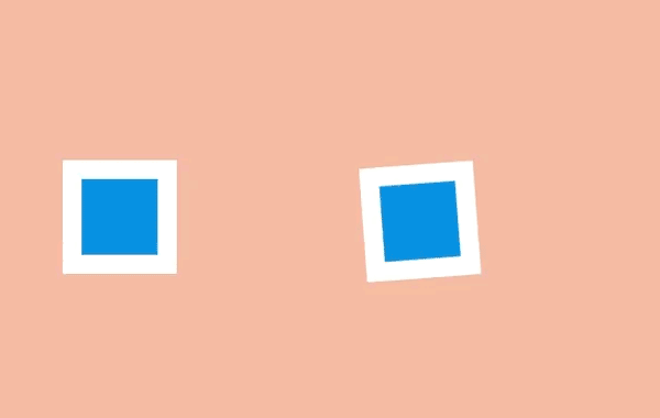
十一、扎实的描绘 (Solid drawing)

扎实的描绘 (Solid drawing)
当动画对象在三维中应该加倍注意确保它们遵循透视原则。因为人们习惯了生活在三维世界里,如果对象表现得与实际不符,会让它看起来很糟糕。如今浏览器对三维变换的支持已经不错,这意味着我们可以在场景里旋转和放置三维对象,浏览器能自动控制它们的转换。
<article class="principle eleven">
    <div class="shape">
      <div class="container">
        <span class="front"></span>
        <span class="back"></span>
        <span class="left"></span>
        <span class="right"></span>
        <span class="top"></span>
        <span class="bottom"></span>
      </div>
    </div>
  </article>
.eleven .shape {
  background: none;
  border: none;
  perspective: 400px;
  perspective-origin: center;
}
.eleven .shape .container {
  animation: eleven 4s infinite cubic-bezier(.6,-0.44,.37,1.44);
  transform-style: preserve-3d;
}
.eleven .shape span {
    display: block;
    position: absolute;
    opacity: 1;
    width: 4em;
    height: 4em;
    border: 1em solid #fff;
    background: #2d97db;
}
.eleven .shape span.front {
  transform: translateZ(3em);
}
.eleven .shape span.back {
  transform: translateZ(-3em);
}
.eleven .shape span.left {
  transform: rotateY(-90deg) translateZ(-3em);
}
.eleven .shape span.right {
  transform: rotateY(-90deg) translateZ(3em);
}
.eleven .shape span.top {
  transform: rotateX(-90deg) translateZ(-3em);
}
.eleven .shape span.bottom {
  transform: rotateX(-90deg) translateZ(3em);
}


@keyframes eleven {
  0% {
    opacity: 0;
  }
  10%, 40% {
    transform: none;
    opacity: 1;
  }
  60%, 75% {
    transform: rotateX(-20deg) rotateY(-45deg) translateY(4em);
    animation-timing-function: cubic-bezier(1,-0.05,.43,-0.16);
    opacity: 1;
  }
  100% {
    transform: translateZ(-180em) translateX(20em);
    opacity: 0;
  }
}
十二、吸引力 (Appeal)

吸引力 (Appeal)
吸引力是艺术作品的特质,让我们与艺术家的想法连接起来。就像一个演员身上的魅力,是注重细节和动作相结合而打造吸引性的结果。
精心制作网页上的动画可以打造出吸引力,例如 Stripe 这样的公司用了大量的动画去增加它们结账流程的可靠性。
<article class="principle twelve">
    <div class="shape">
      <div class="container">
        <span class="item one"></span>
        <span class="item two"></span>
        <span class="item three"></span>
        <span class="item four"></span>
      </div>
    </div>
  </article>
.twelve .shape {
  background: none;
  border: none;
  perspective: 400px;
  perspective-origin: center;
}

.twelve .shape .container {
  animation: show-container 8s infinite cubic-bezier(.6,-0.44,.37,1.44);
  transform-style: preserve-3d;
  width: 4em;
  height: 4em;
  border: 1em solid #fff;
  background: #2d97db;
  position: relative;
}

.twelve .item {
  background-color: #1f7bb6;
  position: absolute;
}

.twelve .item.one {
  animation: show-text 8s 0.1s infinite ease-out;
  height: 6%;
  width: 30%;
  top: 15%;
  left: 25%;
}

.twelve .item.two {
  animation: show-text 8s 0.2s infinite ease-out;
  height: 6%;
  width: 20%;
  top: 30%;
  left: 25%;
}

.twelve .item.three {
  animation: show-text 8s 0.3s infinite ease-out;
  height: 6%;
  width: 50%;
  top: 45%;
  left: 25%;
}

.twelve .item.four {
  animation: show-button 8s infinite cubic-bezier(.64,-0.36,.1,1.43);
  height: 20%;
  width: 40%;
  top: 65%;
  left: 30%;
}

@keyframes show-container {
  0% {
    opacity: 0;
    transform: rotateX(-90deg);
  }
  10% {
    opacity: 1;
    transform: none;
    width: 4em;
    height: 4em;
  }
  15%, 90% {
    width: 12em;
    height: 12em;
    transform: translate(-4em, -4em);
    opacity: 1;
  }
  100% {
    opacity: 0;
    transform: rotateX(-90deg);
    width: 4em;
    height: 4em;
  }
}

@keyframes show-text {
  0%, 15% {
    transform: translateY(1em);
    opacity: 0;
  }
  20%, 85% {
    opacity: 1;
    transform: none;
  }
  88%, 100% {
    opacity: 0;
    transform: translateY(-1em);
    animation-timing-function: cubic-bezier(.64,-0.36,.1,1.43);
  }
}

@keyframes show-button {
  0%, 25% {
    transform: scale(0);
    opacity: 0;
  }
  35%, 80% {
    transform: none;
    opacity: 1;
  }
  90%, 100% {
    opacity: 0;
    transform: scale(0);
  }
}

前几个CSS,省略了基本的body .shape .principle
注:第一个设置了body .shape .principle,后面都省略了,自己填上就可以了。
关于本文
译者:@Ethon Lau
译文:https://cssanimation.rocks/cn/principles/
作者:@donovanh
原文:https://cssanimation.rocks/principles/
正则表达式的语法规则+例子
一、行定位符(^和$)
行定位符就是用来描述字串的边界。“^”表示行的开始;“$”表示行的结尾。如:
^tm : 该表达式表示要匹配字串tm的开始位置是行头,如tm equal Tomorrow Moon就可以匹配
tm$ : 该表达式表示要匹配字串tm的位置是行尾,Tomorrow Moon equal tm匹配。
如果要匹配的字串可以出现在字符串的任意部分,那么可以直接 写成 :tm
二、单词定界符(\b、\B)
单词分界符\b,表示要查找的字串为一个完整的单词。如:\btm\b
还有一个大写的\B,意思和\b相反。它匹配的字串不能是一个完整的单词,而是其他单词或字串的一部分。如:\Btm\B
三、字符类([ ])
正则表达式是区分大小写的,如果要忽略大小写可使用方括号表达式“[]”。只要匹配的字符出现在方括号内,即可表示匹配成功。但要注意:一个方括号只能匹配一个字符。例如,要匹配的字串tm不区分大小写,那么该表达式应该写作如下格式:Tt
四、选择字符(|)
还有一种方法可以实现上面的匹配模式,就是使用选择字符(|)。该字符可以理解为“或”,如上例也可以写成 (T|t)(M|m),该表达式的意思是以字母T或t开头,后面接一个字母M或m。
使用“[]”和使用“|”的区别在于“[]”只能匹配单个字符,而“|”可以匹配任意长度的字串。如果不怕麻烦,上例还可以写为 :TM|tm|Tm|tM
五、连字符(-)
变量的命名规则是只能以字母和下划线开头。但这样一来,如果要使用正则表达式来匹配变量名的第一个字母,要写为 :[a,b,c,d…A,B,C,D…]
这无疑是非常麻烦的,正则表达式提供了连字符“-”来解决这个问题。连字符可以表示字符的范围。如上例可以写成 :[a-zA-Z]
六、排除字符([^])
上面的例子是匹配符合命名规则的变量。现在反过来,匹配不符合命名规则的变量,正则表达式提供了“^”字符。这个元字符在前面出现过,表示行的开始。而这里将会放到方括号中,表示排除的意思。
例如:a-zA-Z,该表达式匹配的就是不以字母和下划线开头的变量名。
七、限定符(? * + {n,m})
对于重复出现字母或字串,可以使用限定符来实现匹配。
八、点号字符(.)
点字符(.)可以匹配出换行符外的任意一个字符。
注意:是除了换行符外的、任意的一个字符。如匹配以s开头、t结尾、中间包含一个字母的单词。
格式如下: ^s.t$,匹配的单词包括:sat、set、sit等。
再举一个实例,匹配一个单词,它的第一个字母为r,第3个字母为s,最后一个字母为t。能匹配该单词的正则表达式为:^r.s.*t$
九、转义字符(\)
正则表达式中的转移字符(\)和PHP中的大同小异,都是将特殊字符(如“.”、“?”、“\”等)变为普通的字符。举一个IP地址的实例,用正则表达式匹配诸如127.0.0.1这样格式的IP地址。如果直接使用点字符,格式为:[0-9]{1,3}(.[0-9]{1,3}){3}
这显然不对,因为“.”可以匹配一个任意字符。这时,不仅是127.0.0.1这样的IP,连127101011这样的字串也会被匹配出来。所以在使用“.”时,需要使用转义字符(\)。修改后上面的正则表达式格式为: [0-9]{1,3}(.[0-9]{1,3}){3}
十、反斜线(\)
除了可以做转义字符外,反斜线还有其他一些功能。反斜线可以将一些不可打印的字符显示出来.
还可以指定预定义字符集,如表所示:
反斜线还有一种功能,就是定义断言,其中已经了解过了\b、\B,其他如表所示:
十一、括号字符(())
小括号字符的第一个作用就是可以改变限定符的作用范围,如“|”、“*”、“^”等。来看下面的一个表达式。
(thir|four)th,这个表达式的意思是匹配单词thirth或fourth,如果不使用小括号,那么就变成了匹配单词thir和fourth了。
小括号的第二个作用是分组,也就是子表达式。如(.[0-9]{1,3}){3},就是对分组(.[0-9]{1,3})进行重复操作。后面要学到的反向引用和分组有着直接的关系。
十二、反向引用
十三、模式修饰符
模式修饰符的作用是设定模式。也就是规定正则表达式应该如何解释和应用。不同的语言都有自己的模式设置
正则表达式例子
一、校验数字的表达式
 1 数字:^[0-9]*$
 2 n位的数字:^\d{n}$
 3 至少n位的数字:^\d{n,}$
 4 m-n位的数字:^\d{m,n}$
 5 零和非零开头的数字:^(0|[1-9][0-9]*)$
 6 非零开头的最多带两位小数的数字:^([1-9][0-9]*)+(.[0-9]{1,2})?$
 7 带1-2位小数的正数或负数:^(\-)?\d+(\.\d{1,2})?$
 8 正数、负数、和小数:^(\-|\+)?\d+(\.\d+)?$
 9 有两位小数的正实数:^[0-9]+(.[0-9]{2})?$
10 有1~3位小数的正实数:^[0-9]+(.[0-9]{1,3})?$
11 非零的正整数:^[1-9]\d*$ 或 ^([1-9][0-9]*){1,3}$ 或 ^\+?[1-9][0-9]*$
12 非零的负整数:^\-[1-9][]0-9"*$ 或 ^-[1-9]\d*$
13 非负整数:^\d+$ 或 ^[1-9]\d*|0$
14 非正整数:^-[1-9]\d*|0$ 或 ^((-\d+)|(0+))$
15 非负浮点数:^\d+(\.\d+)?$ 或 ^[1-9]\d*\.\d*|0\.\d*[1-9]\d*|0?\.0+|0$
16 非正浮点数:^((-\d+(\.\d+)?)|(0+(\.0+)?))$ 或 ^(-([1-9]\d*\.\d*|0\.\d*[1-9]\d*))|0?\.0+|0$
17 正浮点数:^[1-9]\d*\.\d*|0\.\d*[1-9]\d*$ 或 ^(([0-9]+\.[0-9]*[1-9][0-9]*)|([0-9]*[1-9][0-9]*\.[0-9]+)|([0-9]*[1-9][0-9]*))$
18 负浮点数:^-([1-9]\d*\.\d*|0\.\d*[1-9]\d*)$ 或 ^(-(([0-9]+\.[0-9]*[1-9][0-9]*)|([0-9]*[1-9][0-9]*\.[0-9]+)|([0-9]*[1-9][0-9]*)))$
19 浮点数:^(-?\d+)(\.\d+)?$ 或 ^-?([1-9]\d*\.\d*|0\.\d*[1-9]\d*|0?\.0+|0)$
二、校验字符的表达式
 1 汉字:^[\u4e00-\u9fa5]{0,}$
 2 英文和数字:^[A-Za-z0-9]+$ 或 ^[A-Za-z0-9]{4,40}$
 3 长度为3-20的所有字符:^.{3,20}$
 4 由26个英文字母组成的字符串:^[A-Za-z]+$
 5 由26个大写英文字母组成的字符串:^[A-Z]+$
 6 由26个小写英文字母组成的字符串:^[a-z]+$
 7 由数字和26个英文字母组成的字符串:^[A-Za-z0-9]+$
 8 由数字、26个英文字母或者下划线组成的字符串:^\w+$ 或 ^\w{3,20}$
 9 中文、英文、数字包括下划线:^[\u4E00-\u9FA5A-Za-z0-9_]+$
10 中文、英文、数字但不包括下划线等符号:^[\u4E00-\u9FA5A-Za-z0-9]+$ 或 ^[\u4E00-\u9FA5A-Za-z0-9]{2,20}$
11 可以输入含有^%&',;=?$\"等字符:[^%&',;=?$\x22]+
12 禁止输入含有~的字符:[^~\x22]+
三、特殊需求表达式
 1 Email地址:^\w+([-+.]\w+)*@\w+([-.]\w+)*\.\w+([-.]\w+)*$
 2 域名:[a-zA-Z0-9][-a-zA-Z0-9]{0,62}(/.[a-zA-Z0-9][-a-zA-Z0-9]{0,62})+/.?
 3 InternetURL:[a-zA-z]+://[^\s]* 或 ^http://([\w-]+\.)+[\w-]+(/[\w-./?%&=]*)?$
 4 手机号码:^(13[0-9]|14[0-9]|15[0-9]|16[0-9]|17[0-9]|18[0-9]|19[0-9])\d{8}$ (由于工信部放号段不定时,所以建议使用泛解析 ^([1][3,4,5,6,7,8,9])\d{9}$)
 5 电话号码("XXX-XXXXXXX"、"XXXX-XXXXXXXX"、"XXX-XXXXXXX"、"XXX-XXXXXXXX"、"XXXXXXX"和"XXXXXXXX):^(\(\d{3,4}-)|\d{3.4}-)?\d{7,8}$
 6 国内电话号码(0511-4405222、021-87888822):\d{3}-\d{8}|\d{4}-\d{7}
 7 18位身份证号码(数字、字母x结尾):^((\d{18})|([0-9x]{18})|([0-9X]{18}))$
 8 帐号是否合法(字母开头,允许5-16字节,允许字母数字下划线):^[a-zA-Z][a-zA-Z0-9_]{4,15}$
 9 密码(以字母开头,长度在6~18之间,只能包含字母、数字和下划线):^[a-zA-Z]\w{5,17}$
10 强密码(必须包含大小写字母和数字的组合,不能使用特殊字符,长度在8-10之间):^(?=.*\d)(?=.*[a-z])(?=.*[A-Z]).{8,10}$
11 日期格式:^\d{4}-\d{1,2}-\d{1,2}
12 一年的12个月(01~09和1~12):^(0?[1-9]|1[0-2])$
13 一个月的31天(01~09和1~31):^((0?[1-9])|((1|2)[0-9])|30|31)$
14 钱的输入格式:
15    1.有四种钱的表示形式我们可以接受:"10000.00" 和 "10,000.00", 和没有 "分" 的 "10000" 和 "10,000":^[1-9][0-9]*$
16    2.这表示任意一个不以0开头的数字,但是,这也意味着一个字符"0"不通过,所以我们采用下面的形式:^(0|[1-9][0-9]*)$
17    3.一个0或者一个不以0开头的数字.我们还可以允许开头有一个负号:^(0|-?[1-9][0-9]*)$
18    4.这表示一个0或者一个可能为负的开头不为0的数字.让用户以0开头好了.把负号的也去掉,因为钱总不能是负的吧.下面我们要加的是说明可能的小数部分:^[0-9]+(.[0-9]+)?$
19    5.必须说明的是,小数点后面至少应该有1位数,所以"10."是不通过的,但是 "10" 和 "10.2" 是通过的:^[0-9]+(.[0-9]{2})?$
20    6.这样我们规定小数点后面必须有两位,如果你认为太苛刻了,可以这样:^[0-9]+(.[0-9]{1,2})?$
21    7.这样就允许用户只写一位小数.下面我们该考虑数字中的逗号了,我们可以这样:^[0-9]{1,3}(,[0-9]{3})*(.[0-9]{1,2})?$
22    8.1到3个数字,后面跟着任意个 逗号+3个数字,逗号成为可选,而不是必须:^([0-9]+|[0-9]{1,3}(,[0-9]{3})*)(.[0-9]{1,2})?$
23    备注:这就是最终结果了,别忘了"+"可以用"*"替代如果你觉得空字符串也可以接受的话(奇怪,为什么?)最后,别忘了在用函数时去掉去掉那个反斜杠,一般的错误都在这里
24 xml文件:^([a-zA-Z]+-?)+[a-zA-Z0-9]+\\.[x|X][m|M][l|L]$
25 中文字符的正则表达式:[\u4e00-\u9fa5]
26 双字节字符:[^\x00-\xff]    (包括汉字在内,可以用来计算字符串的长度(一个双字节字符长度计2,ASCII字符计1))
27 空白行的正则表达式:\n\s*\r    (可以用来删除空白行)
28 HTML标记的正则表达式:<(\S*?)[^>]*>.*?</\1>|<.*? />    (网上流传的版本太糟糕,上面这个也仅仅能部分,对于复杂的嵌套标记依旧无能为力)
29 首尾空白字符的正则表达式:^\s*|\s*$或(^\s*)|(\s*$)    (可以用来删除行首行尾的空白字符(包括空格、制表符、换页符等等),非常有用的表达式)
30 腾讯QQ号:[1-9][0-9]{4,}    (腾讯QQ号从10000开始)
31 中国邮政编码:[1-9]\d{5}(?!\d)    (中国邮政编码为6位数字)
32 IP地址:\d+\.\d+\.\d+\.\d+    (提取IP地址时有用)
33 IP地址:((?:(?:25[0-5]|2[0-4]\\d|[01]?\\d?\\d)\\.){3}(?:25[0-5]|2[0-4]\\d|[01]?\\d?\\d))

3月的某一天………………不解释…………
HTML5新增文档结构元素
1. 简介:
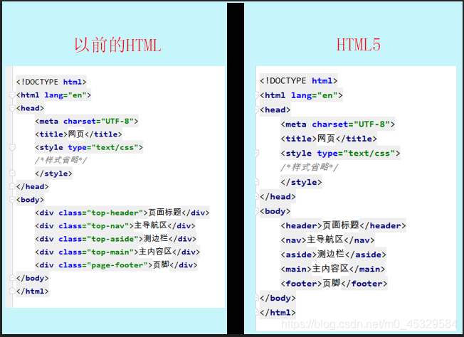
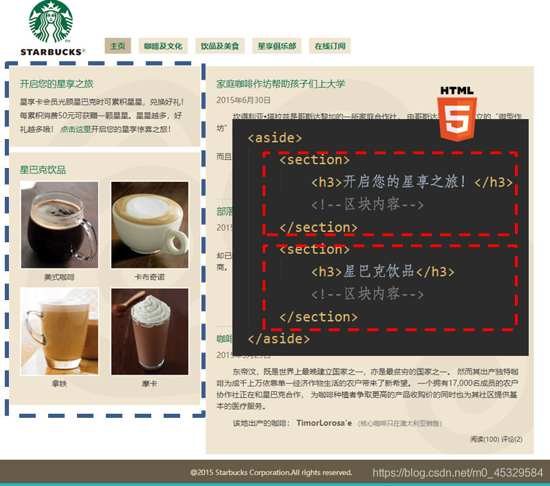
相比HTML4在HTML5中有一个比较重大的变化就是新增了很多新的结构元素,例如article、section、aside、nav、header等。
这些元素和div的元素有类似的功能,但是具有更强的语义表示。
总结一句话就是:“见其名知其意”。
2. 为什么要引入语义元素呢?
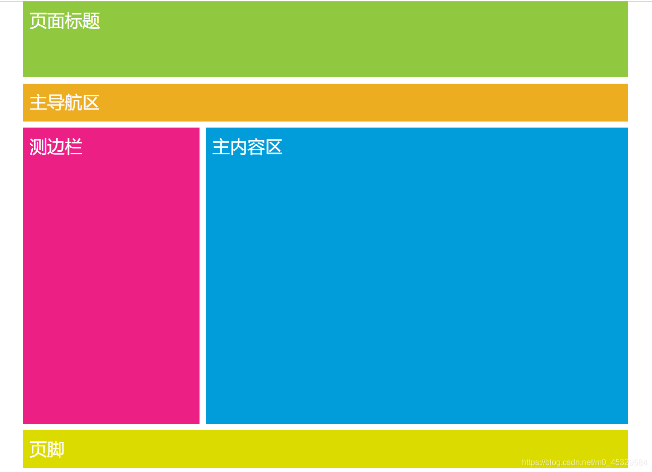
在这里很多朋友就会产生疑问了,这些新语义元素既然和div的元素具有类似的功能为什么还要引入这些语义元素呢?
以上面这案例为例进行比较:
3. 新增语义标签简介:
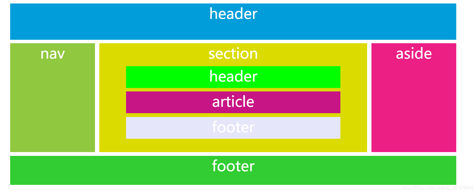
区块标签:article、section、nav、aside、header、footer、figure、figcaption、main
内联标签:time、i、b、em、stromg
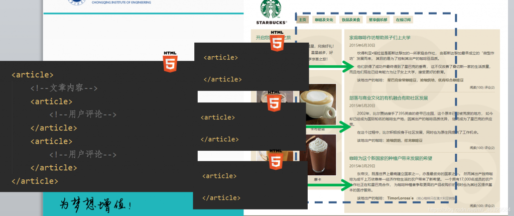
- article ———-定义文章
- section——— 定义页眉:一个主题性的内容分组,通常包含一个头部(header),可能还会有一个尾部(footer)
- nav —————定义导航:表示页面的导航,可以通过导航连接到网站的其他页面,或当前页面的其他部分
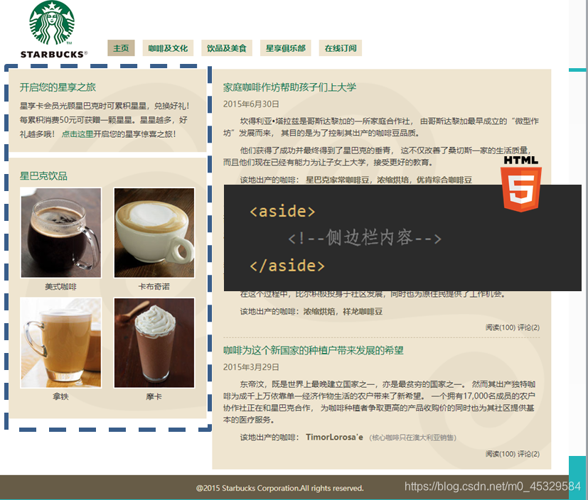
- aside————–定义文章的侧边栏:包含的内容不是页面的主要内容,具有独特性,是对页面的补充
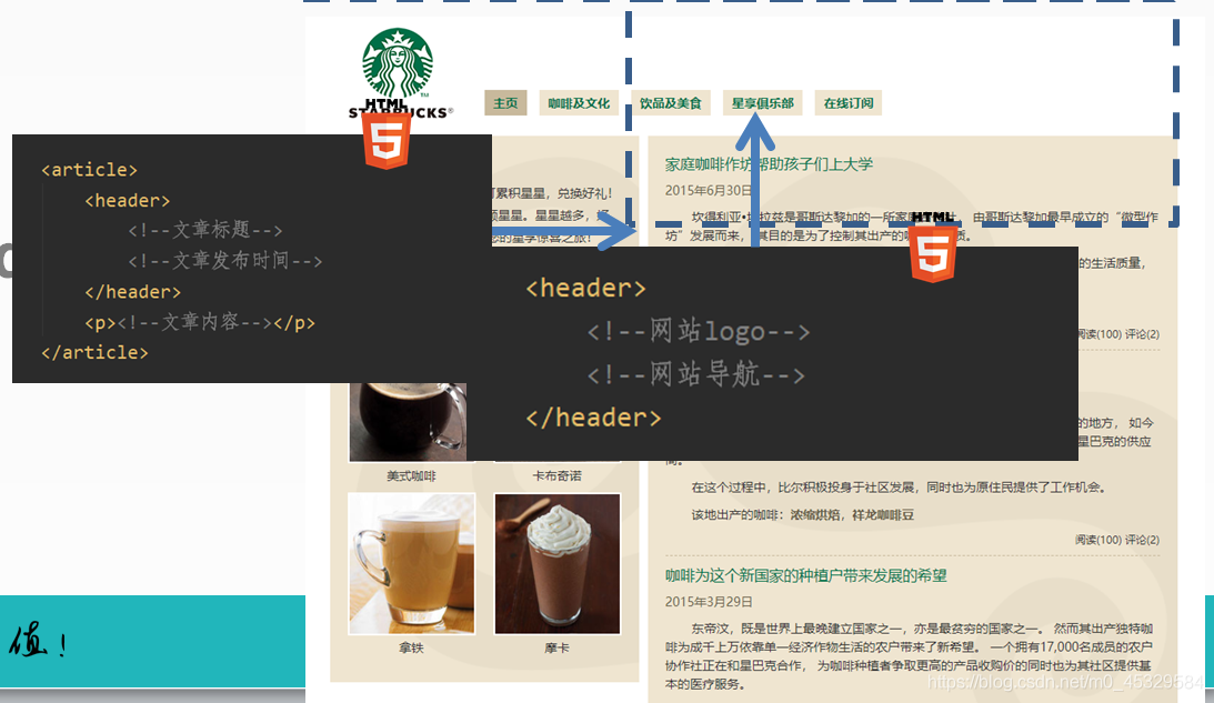
- header ———–定义页眉:一般放置在页面的顶部,或者页面中某个区块元素的顶部,包含整个页面或某个区块的标题、简介等信息
- footer ————-定义页脚:一般被放置在页面的底部,或者页面中某个区块元素的底部
- figure ————–标签规定独立的流内容(图像、图表、照片、代码等等)
- figcaption ——–figure的子元素 用于对figure的内容 进行说明
- main —————-显示页面的主题内容,每个页面只能包含一个main标签,main标签中不包含网站标题、logo、主导航、版权声明等信息
4. 新增语义标签的使用:
使用article的例子:
- 一篇博客
- 一个论坛帖子
- 一篇新闻报道
- 一个用户评论
header标签的使用:
一篇文档中可以包含多于一个的header标签
header标签不一定非要显示在页面的上方,它的内容决定这里需要使用header标签,位置并不重要
可以为body、article、section、aside、添加header元素
footer标签的使用:

nav标签的使用:

aside标签的使用:
- 页面测边栏
- 广告
- 友情链接
- 文章引语(内容摘要)
section标签的使用:
main标签的使用:

五、案例实现:
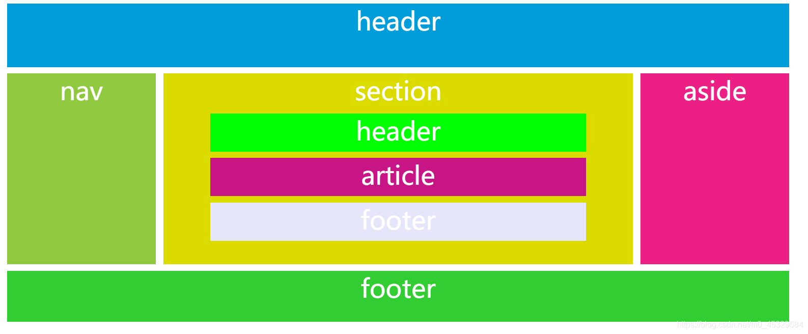
HTML5+CSS代码:
 <!DOCTYPE html>
<html lang="en">
<head>
<title>测试</title>
<meta charset="UTF-8">
<style type="text/css">
body{
width: 80%;
background-color: white;
margin: 0 auto;
text-align: center;
font-size: 40px;
color: white;
}
header{
width: 100%;
height: 100px;
background-color: #009dda;
}
nav{
width: 19%;
height: 300px;
background-color: #90c840;
float: left;
}
section{
width: 60%;
height: 300px;
background-color: #dbdb00;
float: left;
margin-left: 1%;
}
aside{
width: 19%;
height: 300px;
background-color: #ec1f85;
margin-left: 81%;
}
footer{
width: 100%;
height: 80px;
background-color: limegreen;
}
section>header{
height: 60px;
background-color: lime;
width: 80%;
margin: 0 auto;
}
section>article{
height: 60px;
background-color: mediumvioletred;
width: 80%;
margin: 0 auto;
}
section>footer{
height: 60px;
background-color: lavender;
width: 80%;
margin: 0 auto;
}
section>header,
section>article,
section>footer,
header,
nav,
section,
section,
aside,
footer{
margin-top: 10px;
}
</style>

</head>
<body>
<header>header</header>
<nav>nav</nav>
<section>section
<header>header</header>
<article>article</article>
<footer>footer</footer>
</section>
<aside>aside</aside>
<footer>footer</footer>
</body>
</html>