CSS 动画Animations 入门与进阶
本文将比较全面细致的梳理一下 CSS 动画的方方面面,针对每个属性用法的讲解及进阶用法的示意,希望能成为一个比较好的从入门到进阶的教程。
CSS 动画介绍及语法
首先,我们来简单介绍一下 CSS 动画。
最新版本的 CSS 动画由规范 — CSS Animations Level 1定义。
CSS 动画用于实现元素从一个 CSS 样式配置转换到另一个 CSS 样式配置。
动画包括两个部分: 描述动画的样式规则和用于指定动画开始、结束以及中间点样式的关键帧。
简单来说,看下面的例子:
div {
animation: change 3s;
}
@keyframes change {
0% {
color: #f00;
}
100% {
color: #000;
}
}
一个 CSS 动画一定要由上述两部分组成。
CSS 动画的语法
接下来,我们简单看看 CSS 动画的语法。
创建动画序列,需要使用 animation 属性或其子属性,该属性允许配置动画时间、时长以及其他动画细节,但该属性不能配置动画的实际表现,动画的实际表现是由 @keyframes 规则实现。
animation 的子属性有:
-
animation-name:指定由 @keyframes 描述的关键帧名称。
-
animation-duration:设置动画一个周期的时长。
-
animation-delay:设置延时,即从元素加载完成之后到动画序列开始执行的这段时间。
-
animation-direction:设置动画在每次运行完后是反向运行还是重新回到开始位置重复运行。
-
animation-iteration-count:设置动画重复次数, 可以指定 infinite 无限次重复动画
-
animation-play-state:允许暂停和恢复动画。
-
animation-timing-function:设置动画速度, 即通过建立加速度曲线,设置动画在关键帧之间是如何变化。
-
animation-fill-mode:指定动画执行前后如何为目标元素应用样式
-
@keyframes 规则,当然,一个动画想要运行,还应该包括 @keyframes 规则,在内部设定动画关键帧
其中,对于一个动画:
-
必须项:animation-name、animation-duration 和 @keyframes规则
-
非必须项:animation-delay、animation-direction、animation-iteration-count、animation-play-state、animation-timing-function、animation-fill-mode,当然不是说它们不重要,只是不设置时,它们都有默认值
上面已经给了一个简单的 DEMO, 就用上述的 DEMO,看看结果:
这就是一个最基本的 CSS 动画,本文将从 animation 的各个子属性入手,探究 CSS 动画的方方面面。
animation-name / animation-duration 详解
整体而言,单个的 animation-name 和 animation-duration 没有太多的技巧,非常好理解,放在一起。
首先介绍一下 animation-name,通过 animation-name,CSS 引擎将会找到对应的 @keyframes 规则。
当然,它和 CSS 规则命名一样,也存在一些骚操作。譬如,他是支持 emoji 表情的,所以代码中的 animation-name 命名也可以这样写:
div {
 animation: face 3s;
}

@keyframes face {
 0% {
 color: #f00;
 }
 100% {
 color: #000;
 }
}
而 animation-duration 设置动画一个周期的时长,上述 DEMO 中,就是设定动画整体持续 3s,这个也非常好理解。
animation-delay 详解
animation-delay 就比较有意思了,它可以设置动画延时,即从元素加载完成之后到动画序列开始执行的这段时间。
简单的一个 DEMO:
<div></div>
<div></div>
div {
width: 100px;
height: 100px;
background: #000;
animation-name: move;
animation-duration: 2s;
}
div:nth-child(2) {
animation-delay: 1s;
}
@keyframes move {
0% {
transform: translate(0);
}
100% {
transform: translate(200px);
}
}
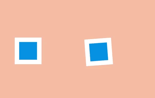
比较下列两个动画,一个添加了 animation-delay,一个没有,非常直观:


上述第二个 div,关于 animation 属性,也可以简写为 animation: move 2s 1s,第一个时间值表示持续时间,第二个时间值表示延迟时间。
animation-delay 可以为负值
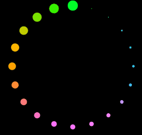
关于 animation-delay,最有意思的技巧在于,它可以是负数。也就是说,虽然属性名是动画延迟时间,但是运用了负数之后,动画可以提前进行。
假设我们要实现这样一个 loading 动画效果:
有几种思路:
方案 2 的核心伪代码如下:
 .item:nth-child(1) {
     animation: rotate 3s infinite linear;
 }
 .item:nth-child(2) {
     animation: rotate 3s infinite 1s linear;
 }
 .item:nth-child(3) {
     animation: rotate 3s infinite 2s linear;
 }
但是,在动画的前 2s,另外两个元素是不会动的,只有 2s 过后,整个动画才是我们想要的:
此时,我们可以让第 2、3 个元素的延迟时间,改为负值,这样可以让动画延迟进行 -1s、-2s,也就是提前进行 1s、2s:
 .item:nth-child(1) {
     animation: rotate 3s infinite linear;
 }
 .item:nth-child(2) {
     animation: rotate 3s infinite -1s linear;
 }
 .item:nth-child(3) {
     animation: rotate 3s infinite -2s linear;
 }
这样,每个元素都无需等待,直接就是运动状态中的,并且元素间隔位置是我们想要的结果:
利用 animation-duration 和 animation-delay 构建随机效果
还有一个有意思的小技巧。
同一个动画,我们利用一定范围内随机的 animation-duration 和一定范围内随机的 animation-delay,可以有效的构建更为随机的动画效果,让动画更加的自然。
我在下述两个纯 CSS 动画中,都使用了这样的技巧:
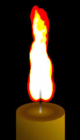
纯 CSS 实现华为充电动画:
纯 CSS 实现华为充电动画
【第1816期】巧用 CSS 实现酷炫的充电动画
纯 CSS 实现火焰动画
 纯 CSS 实现火焰动画
【第1568期】CSS 火焰
以纯 CSS 实现华为充电动画为例子,简单讲解一下。
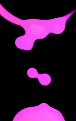
仔细观察这一部分,上升的一个一个圆球,抛去这里的一些融合效果,只关注不断上升的圆球,看着像是没有什么规律可言:
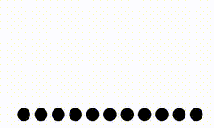
我们来模拟一下,如果是使用 10 个 animation-duration 和 animation-delay 都一致的圆的话,核心伪代码:
 <ul>
     <li></li>
     <!--共 10 个...-->
     <li></li>
 </ul>
 ul {
     display: flex;
     flex-wrap: nowrap;
     gap: 5px;
 }
 li {
     background: #000;
     animation: move 3s infinite 1s linear;
 }
 @keyframes move {
     0% {
         transform: translate(0, 0);
     }
     100% {
         transform: translate(0, -100px);
     }
 }
这样,小球的运动会是这样的整齐划一:
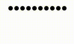
要让小球的运动显得非常的随机,只需要让 animation-duration 和 animation-delay 都在一定范围内浮动即可,改造下 CSS:
 @for $i from 1 to 11 {
     li:nth-child(#{$i}) {
         animation-duration: #{random(2000)/1000 + 2}s;
         animation-delay: #{random(1000)/1000 + 1}s;
     }
 }
我们利用 SASS 的循环和 random() 函数,让 animation-duration 在 2-4 秒范围内随机,让 animation-delay 在 1-2 秒范围内随机,这样,我们就可以得到非常自然且不同的上升动画效果,基本不会出现重复的画面,很好的模拟了随机效果:
CodePen Demo — 利用范围随机 animation-duration 和 animation-delay 实现随机动画效果
animation-timing-function 缓动函数
缓动函数在动画中非常重要,它定义了动画在每一动画周期中执行的节奏。
缓动主要分为两类:
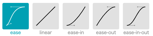
三次贝塞尔曲线缓动函数
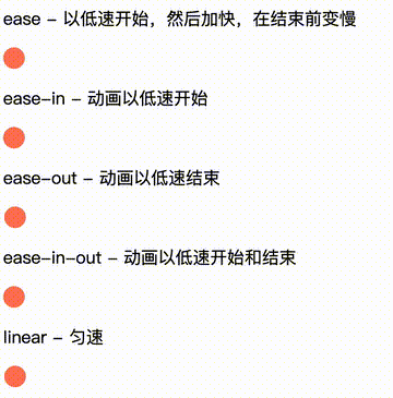
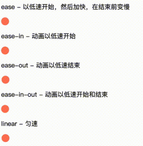
首先先看看三次贝塞尔曲线缓动函数。在 CSS 中,支持一些缓动函数关键字。
 /* Keyword values */
 animation-timing-function: ease;  // 动画以低速开始,然后加快,在结束前变慢
 animation-timing-function: ease-in;  // 动画以低速开始
 animation-timing-function: ease-out; // 动画以低速结束
 animation-timing-function: ease-in-out; // 动画以低速开始和结束
 animation-timing-function: linear; // 匀速,动画从头到尾的速度是相同的
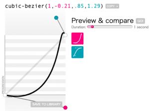
除了 CSS 支持的这 5 个关键字,我们还可以使用 cubic-bezier() 方法自定义三次贝塞尔曲线:
animation-timing-function: cubic-bezier(0.1, 0.7, 1.0, 0.1);
这里有个非常好用的网站 — cubic-bezier用于创建和调试生成不同的贝塞尔曲线参数。
三次贝塞尔曲线缓动对动画的影响
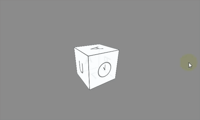
关于缓动函数对动画的影响,这里有一个非常好的示例。这里我们使用了纯 CSS 实现了一个钟的效果,对于其中的动画的运动,如果是 animation-timing-function: linear,效果如下:

而如果我们我把缓动函数替换一下,变成 animation-timing-function: cubic-bezier(1,-0.21,.85,1.29),它的曲线对应如下:
整个钟的动画律动效果将变成这样,完全不一样的感觉:
CodePen Demo – 缓动不同效果不同
对于许多精益求精的动画,在设计中其实都考虑到了缓动函数。很久之前看到过一篇《基于物理学的动画用户体验设计》,可惜如今已经无法找到原文。其中传达出的一些概念是,动画的设计依据实际在生活中的表现去考量。
譬如 linear 这个缓动,实际应用于某些动画中会显得很不自然,因为由于空气阻力的存在,程序模拟的匀速直线运动在现实生活中是很难实现的。因此对于这样一个用户平时很少感知到的运动是很难建立信任感的。这样的匀速直线运动也是我们在进行动效设计时需要极力避免的。
步骤缓动函数
接下来再讲讲步骤缓动函数。在 CSS 的 animation-timing-function 中,它有如下几种表现形态:
{
/* Keyword values */
animation-timing-function: step-start;
animation-timing-function: step-end;
/* Function values */
animation-timing-function: steps(6, start)
animation-timing-function: steps(4, end);
}
在 CSS 中,使用步骤缓动函数最多的,就是利用其来实现逐帧动画。假设我们有这样一张图(图片大小为 1536 x 256,图片来源于网络):
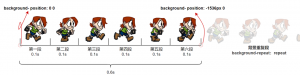
可以发现它其实是一个人物行进过程中的 6 种状态,或者可以为 6 帧,我们利用 animation-timing-function: steps(6) 可以将其用一个 CSS 动画串联起来,代码非常的简单:
 <div class="box"></div>
 .box {
   width: 256px;
   height: 256px;
   background: url('https://github.com/iamalperen/playground/blob/main/SpriteSheetAnimation/sprite.png?raw=true');
   animation: sprite .6s steps(6, end) infinite;
 }
 @keyframes sprite {
   0% {
     background-position: 0 0;
   }
   100% {
     background-position: -1536px 0;
   }
 }
简单解释一下上述代码,首先要知道,刚好 256 x 6 = 1536,所以上述图片其实可以刚好均分为 6 段:
-
我们设定了一个大小都为 256px 的 div,给这个 div 赋予了一个 animation: sprite .6s steps(6) infinite 动画;
-
其中 steps(6) 的意思就是将设定的 @keyframes 动画分为 6 次(6帧)执行,而整体的动画时间是 0.6s,所以每一帧的停顿时长为 0.1s;
-
动画效果是由 background-position: 0 0 到 background-position: -1536px 0,由于上述的 CSS 代码没有设置 background-repeat,所以其实 background-position: 0 0 是等价于 background-position: -1536px 0,就是图片在整个动画过程中推进了一轮,只不过每一帧停在了特点的地方,一共 6 帧;
将上述 1、2、3,3 个步骤画在图上简单示意:

从上图可知,其实在动画过程中,background-position 的取值其实只有 background-position: 0 0,background-position: -256px 0,background-position: -512px 0 依次类推一直到 background-position: -1536px 0,由于背景的 repeat 的特性,其实刚好回到原点,由此又重新开始新一轮同样的动画。
所以,整个动画就会是这样,每一帧停留 0.1s 后切换到下一帧(注意这里是个无限循环动画),:
完整的代码你可以戳这里 — CodePen Demo — Sprite Animation with steps()
animation-duration 动画长短对动画的影响
在这里再插入一个小章节,animation-duration 动画长短对动画的影响也是非常明显的。
在上述代码的基础上,我们再修改 animation-duration,缩短每一帧的时间就可以让步行的效果变成跑步的效果,同理,也可以增加每一帧的停留时间。让每一步变得缓慢,就像是在步行一样。
需要提出的是,上文说的每一帧,和浏览器渲染过程中的 FPS 的每一帧不是同一个概念。
看看效果,设置不同的 animation-duration 的效果(这里是 0.6s -> 0.2s),GIF 录屏丢失了一些关键帧,实际效果会更好点:

当然,在 steps() 中,还有 steps(6, start) 和 steps(6, end) 的差异,也就是其中关键字 start 和 end 的差异。对于上述的无限动画而言,其实基本是可以忽略不计的,它主要是控制动画第一帧的开始和持续时长,比较小的一个知识点但是想讲明白需要比较长的篇幅,限于本文的内容,在这里不做展开,读者可以自行了解。
同个动画效果的补间动画和逐帧动画演绎对比
上述的三次贝塞尔曲线缓动和步骤缓动,其实就是对应的补间动画和逐帧动画。
对于同个动画而言,有的时候两种缓动都是适用的。我们在具体使用的时候需要具体分析选取。
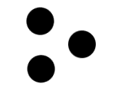
假设我们用 CSS 实现了这样一个图形:
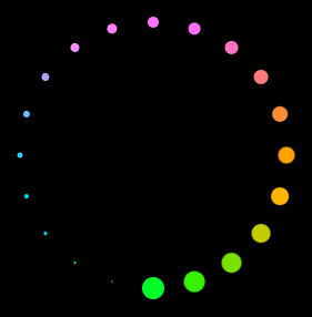
现在想利用这个图形制作一个 Loading 效果,如果利用补间动画,也就是三次贝塞尔曲线缓动的话,让它旋转起来,得到的效果非常的一般:
 .g-container{
     animation: rotate 2s linear infinite;
 }
 @keyframes rotate {
     0% {
         transform: rotate(0);
     }
     100% {
         transform: rotate(360deg);
     }
 }
动画效果如下:
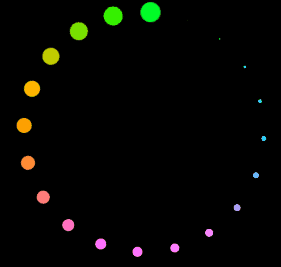
但是如果这里,我们将补间动画换成逐帧动画,因为有 20 个点,所以设置成 steps(20),再看看效果,会得到完全不一样的感觉:
 .g-container{
     animation: rotate 2s steps(20) infinite;
 }
 @keyframes rotate {
     0% {
         transform: rotate(0);
     }
     100% {
         transform: rotate(360deg);
     }
 }
动画效果如下:
整个 loading 的圈圈看上去好像也在旋转,实际上只是 20 帧关键帧在切换,整体的效果感觉更适合 Loading 的效果。
因此,两种动画效果都是很有必要掌握的,在实际使用的时候灵活尝试,选择更适合的。
上述 DEMO 效果完整的代码:CodePen Demo — Scale Loading steps vs linear
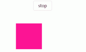
animation-play-state
接下来,我们讲讲 animation-play-state,顾名思义,它可以控制动画的状态 — 运行或者暂停。类似于视频播放器的开始和暂停。是 CSS 动画中有限的控制动画状态的手段之一。
它的取值只有两个(默认为 running):
 {
     animation-play-state: paused | running;
 }
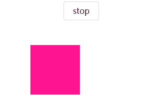
使用起来也非常简单,看下面这个例子,我们在 hover 按钮的时候,实现动画的暂停:
<div class="btn stop">stop</div>
<div class="animation"></div>
.animation {
width: 100px;
height: 100px;
background: deeppink;
animation: move 2s linear infinite alternate;
}
@keyframes move {
100% {
transform: translate(100px, 0);
}
}
.stop:hover ~ .animation {
animation-play-state: paused;
}
一个简单的 CSS 动画,但是当我们 hover 按钮的时候,给动画元素添加上 animation-play-state: paused:
animation-play-state 小技巧,默认暂停,点击运行
正常而言,按照正常思路使用 animation-play-state: paused 是非常简单的。
但是,如果我们想创造一些有意思的 CSS 动画效果,不如反其道而行之。
我们都知道,正常情况下,动画应该是运行状态,那如果我们将一些动画的默认状态设置为暂停,只有当鼠标点击或者 hover 的时候,才设置其 animation-play-state: running,这样就可以得到很多有趣的 CSS 效果。
看个倒酒的例子,这是一个纯 CSS 动画,但是默认状态下,动画处于 animation-play-state: paused,也就是暂停状态,只有当鼠标点击杯子的时,才设置 animation-play-state: running,让酒倒下,

完整的 DEMO 你可以戳这里:CodePen Demo — CSS Beer!
在非常多 Web 创意交互动画我们都可以看到这个技巧的身影。
页面 render 后,无任何操作,动画不会开始。只有当鼠标对元素进行 click ,通过触发元素的 :active 伪类效果的时候,赋予动画 animation-play-state: running,动画才开始进行;动画进行到任意时刻,鼠标停止点击,伪类消失,则动画停止;
animation-fill-mode 控制元素在各个阶段的状态
下一个属性 animation-fill-mode,很多人会误认为它只是用于控制元素在动画结束后是否复位。这个其实是不准确的,不全面的。
看看它的取值:
 {
     // 默认值,当动画未执行时,动画将不会将任何样式应用于目标,而是使用赋予给该元素的 CSS 规则来显示该元素的状态
     animation-fill-mode: none;
     // 动画将在应用于目标时立即应用第一个关键帧中定义的值,并在 `animation-delay` 期间保留此值,
     animation-fill-mode: backwards;
     // 目标将保留由执行期间遇到的最后一个关键帧计算值。最后一个关键帧取决于 `animation-direction` 和 `animation-iteration-count`
     animation-fill-mode: forwards;
     // 动画将遵循 `forwards` 和 `backwards` 的规则,从而在两个方向上扩展动画属性
     animation-fill-mode: both;
 }
对于 animation-fill-mode 的解读,我在 Segment Fault 上的一个问答中(SF – 如何理解 animation-fill-mode)看到了 4 副很好的解读图,这里借用一下:
假设 HTML 如下:
<div class="box"></div>
CSS如下:
.box{
transform: translateY(0);
}
.box.on{
animation: move 1s;
}
@keyframes move{
from{transform: translateY(-50px)}
to {transform: translateY( 50px)}
}
使用图片来表示 translateY 的值与 时间 的关系:
1、animation-fill-mode: none 表现如图:
一句话总结,元素在动画时间之外,样式只受到它的 CSS 规则限制,与 @keyframes 内的关键帧定义无关。
2、animation-fill-mode: backwards 表现如图:
一句话总结,元素在动画开始之前(包含未触发动画阶段及 animation-delay 期间)的样式为动画运行时的第一帧,而动画结束后的样式则恢复为 CSS 规则设定的样式。
3、animation-fill-mode: forwards
一句话总结,元素在动画开始之前的样式为 CSS 规则设定的样式,而动画结束后的样式则表现为由执行期间遇到的最后一个关键帧计算值(也就是停在最后一帧)。
4、animation-fill-mode: both
一话总结,综合了 animation-fill-mode: backwards 和 animation-fill-mode: forwards 的设定。动画开始前的样式为动画运行时的第一帧,动画结束后停在最后一帧。
animation-iteration-count/animation-direction 动画循环次数和方向
讲到了 animation-fill-mode,我们就可以顺带讲讲这个两个比较好理解的属性 — animation-iteration-count 和 animation-direction
在上面讲述 animation-fill-mode 时,我使用了动画运行时的第一帧替代了@keyframes 中定义的第一帧这种说法,因为动画运行的第一帧和最后一帧的实际状态还会受到动画运行方向 animation-direction 和 animation-iteration-count 的影响。
在 CSS 动画中,由 animation-iteration-count 和 animation-direction 共同决定动画运行时的第一帧和最后一帧的状态。
动画的最后一帧,也就是动画运行的最终状态,并且我们可以利用 animation-fill-mode: forwards 让动画在结束后停留在这一帧,这个还是比较好理解的,但是 animation-fill-mode: backwards 和 animation-direction 的关系很容易弄不清楚,这里简答讲解下。
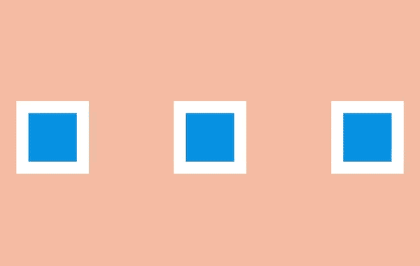
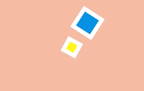
设置一个 100px x 100px 的滑块,在一个 400px x 100px 的容器中,其代码如下:
 <div class="g-father">
     <div class="g-box"></div>
 </div>
 .g-father {
     width: 400px;
     height: 100px;
     border: 1px solid #000;
 }
 .g-box {
     width: 100px;
     height: 100px;
     background: #333;
 }
表现如下:
那么,加入 animation 之后,在不同的 animation-iteration-count 和 animation-direction 作用下,动画的初始和结束状态都不一样。
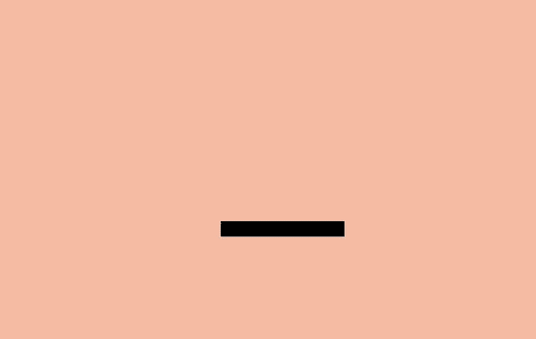
如果设置了 animation-fill-mode: backwards,则元素在动画未开始前的状态由 animation-direction 决定:
 .g-box {
     ...
     animation: move 4s linear;
     animation-play-state: paused;
     transform: translate(0, 0);
 }
 @keyframes move {
     0% {
         transform: translate(100px, 0);
     }
     100% {
         transform: translate(300px, 0);
     }
 }
注意这里 CSS 规则中,元素没有设置位移 transform: translate(0, 0),而在动画中,第一个关键帧和最后一个关键的 translateX 分别是 100px、300px,配合不同的 animation-direction 初始状态如下。
下图假设我们设置了动画默认是暂停的 — animation-play-state: paused,那么动画在开始前的状态为:
动画的分治与复用
讲完了每一个属性,我们再来看看一些动画使用过程中的细节。
看这样一个动画:
 <div></div>
 div {
     width: 100px;
     height: 100px;
     background: #000;
     animation: combine 2s;
 }
 @keyframes combine {
     100% {
         transform: translate(0, 150px);
         opacity: 0;
     }
 }
这里我们实现了一个 div 块下落动画,下落的同时产生透明度的变化:
对于这样一个多个属性变化的动画,它其实等价于:
div {
animation: falldown 2s, fadeIn 2s;
}
@keyframes falldown {
100% {
transform: translate(0, 150px);
}
}
@keyframes fadeIn {
100% {
opacity: 0;
}
}
在 CSS 动画规则中,animation 是可以接收多个动画的,这样做的目的不仅仅只是为了复用,同时也是为了分治,我们对每一个属性层面的动画能够有着更为精确的控制。
keyframes 规则的设定
我们经常能够在各种不同的 CSS 代码见到如下两种 CSS @keyframes 的设定:
1、使用百分比
 @keyframes fadeIn {
     0% {
         opacity: 1;
     }
     100% {
         opacity: 0;
     }
 }
2、使用 from 及 to
 @keyframes fadeIn {
     from {
         opacity: 1;
     }
     to {
         opacity: 0;
     }
 }
在 CSS 动画 @keyframes 的定义中,from 等同于 0%,而 to 等同于 100%。
当然,当我们的关键帧不止 2 帧的时,更推荐使用百分比定义的方式。
除此之外,当动画的起始帧等同于 CSS 规则中赋予的值并且没有设定 animation-fill-mode,0% 和 from 这一帧是可以删除的。
动画状态的高优先级性
我曾经在这篇文章中 — 深入理解 CSS(Cascading Style Sheets)中的层叠(Cascading)讲过一个很有意思的 CSS 现象。
这也是很多人对 CSS 优先级的一个认知误区,在 CSS 中,优先级还需要考虑选择器的层叠(级联)顺序。
只有在层叠顺序相等时,使用哪个值才取决于样式的优先级。
那什么是层叠顺序呢?
根据 CSS Cascading 4 最新标准:CSS Cascading and Inheritance Level 5(Current Work)
定义的当前规范下申明的层叠顺序优先级如下(越往下的优先级越高,下面的规则按升序排列):
-
Normal user agent declarations
-
Normal user declarations
-
Normal author declarations
-
Animation declarations
-
Important author declarations
-
Important user declarations
-
Important user agent declarations
-
Transition declarations
简单翻译一下:
按照上述算法,大概是这样:
过渡动画过程中每一帧的样式 > 用户代理、用户、页面作者设置的!important样式 > 动画过程中每一帧的样式优先级 > 页面作者、用户、用户代理普通样式。
然而,经过多个浏览器的测试,实际上并不是这样。(尴尬了)
举个例子,我们可以通过这个特性,覆盖掉行内样式中的 !important 样式:
 <p class="txt" style="color: red!important;">123456789</p>
 .txt {
     animation: colorGreen 2s infinite;
 }
 @keyframes colorGreen {
     0%,
     100% {
         color: green;
     }
 }
在 Safari 浏览器下,上述 DEMO 文本的颜色为绿色,也就是说,处于动画状态中的样式,能够覆盖掉行内样式中的 !important 样式,属于最最高优先级的一种样式,我们可以通过无限动画、或者 animation-fill-mode: forwards,利用这个技巧,覆盖掉本来应该是优先级非常非常高的行内样式中的 !important 样式。
我在早两年的 Chrome 中也能得到同样的结果,但是到今天(2022-01-10),最新版的 Chrome 已经不支持动画过程中关键帧样式优先级覆盖行内样式 !important 的特性。
对于不同浏览器,感兴趣的同学可以利用我这个 DEMO 自行尝试,CodePen Demo – the priority of CSS Animation
CSS 动画的优化
这也是非常多人非常关心的一个重点。
我的 CSS 动画很卡,我应该如何去优化它?
动画元素生成独立的 GraphicsLayer,强制开始 GPU 加速
CSS 动画很卡,其实是一个现象描述,它的本质其实是在动画过程中,浏览器刷新渲染页面的帧率过低。通常而言,目前大多数浏览器刷新率为 60 次/秒,所以通常来讲 FPS 为 60 frame/s 时动画效果较好,也就是每帧的消耗时间为 16.67ms。
页面处于动画变化时,当帧率低于一定数值时,我们就感觉到页面的卡顿。
而造成帧率低的原因就是浏览器在一帧之间处理的事情太多了,超过了 16.67ms,要优化每一帧的时间,又需要完整地知道浏览器在每一帧干了什么,这个就又涉及到了老生常谈的浏览器渲染页面。
到今天,虽然不同浏览器的渲染过程不完全相同,但是基本上大同小异,基本上都是:
简化一下也就是这个图:
这两张图,你可以在非常多不同的文章中看到。
回归本文的重点,Web 动画很大一部分开销在于层的重绘,以层为基础的复合模型对渲染性能有着深远的影响。当不需要绘制时,复合操作的开销可以忽略不计,因此在试着调试渲染性能问题时,首要目标就是要避免层的重绘。那么这就给动画的性能优化提供了方向,减少元素的重绘与回流。
这其中,如何减少页面的回流与重绘呢,这里就会运用到我们常说的** GPU 加速**。
GPU 加速的本质其实是减少浏览器渲染页面每一帧过程中的 reflow 和 repaint,其根本,就是让需要进行动画的元素,生成自己的 GraphicsLayer。
浏览器渲染一个页面时,它使用了许多没有暴露给开发者的中间表现形式,其中最重要的结构便是层(layer)。
在 Chrome 中,存在有不同类型的层:RenderLayer(负责 DOM 子树),GraphicsLayer(负责 RenderLayer 的子树)。
GraphicsLayer ,它对于我们的 Web 动画而言非常重要,通常,Chrome 会将一个层的内容在作为纹理上传到 GPU 前先绘制(paint)进一个位图中。如果内容不会改变,那么就没有必要重绘(repaint)层。
而当元素生成了自己的 GraphicsLayer 之后,在动画过程中,Chrome 并不会始终重绘整个层,它会尝试智能地去重绘 DOM 中失效的部分,也就是发生动画的部分,在 Composite 之前,页面是处于一种分层状态,借助 GPU,浏览器仅仅在每一帧对生成了自己独立 GraphicsLayer 元素层进行重绘,如此,大大的降低了整个页面重排重绘的开销,提升了页面渲染的效率。
因此,CSS 动画(Web 动画同理)优化的第一条准则就是让需要动画的元素生成了自己独立的 GraphicsLayer,强制开始 GPU 加速,而我们需要知道是,GPU 加速的本质是利用让元素生成了自己独立的 GraphicsLayer,降低了页面在渲染过程中重绘重排的开销。
当然,生成自己的独立的 GraphicsLayer,不仅仅只有 transform3d api,还有非常多的方式。在 CSS 中,包括但不限于(找了很多文档,没有很全面的,需要一个一个去尝试,通过开启 Chrome 的 Layer border 选项):
-
3D 或透视变换(perspective、transform) CSS 属性
-
使用加速视频解码的
-
拥有 3D (WebGL) 上下文或加速的 2D 上下文的 元素
-
混合插件(如 Flash)
-
对自己的 opacity 做 CSS 动画或使用一个动画变换的元素
-
拥有加速 CSS 过滤器的元素
-
元素有一个包含复合层的后代节点(换句话说,就是一个元素拥有一个子元素,该子元素在自己的层里)
-
元素有一个 z-index 较低且包含一个复合层的兄弟元素(换句话说就是该元素在复合层上面渲染)
对于上述一大段非常绕的内容,你可以再看看这几篇文章:
除了上述准则之外,还有一些提升 CSS 动画性能的建议:
减少使用耗性能样式
不同样式在消耗性能方面是不同的,改变一些属性的开销比改变其他属性要多,因此更可能使动画卡顿。
例如,与改变元素的文本颜色相比,改变元素的 box-shadow 将需要开销大很多的绘图操作。box-shadow 属性,从渲染角度来讲十分耗性能,原因就是与其他样式相比,它们的绘制代码执行时间过长。这就是说,如果一个耗性能严重的样式经常需要重绘,那么你就会遇到性能问题。
类似的还有 CSS 3D 变换、mix-blend-mode、filter,这些样式相比其他一些简单的操作,会更加的消耗性能。我们应该尽可能的在动画过程中降低其使用的频率或者寻找替代方案。
当然,没有不变的事情,在今天性能很差的样式,可能明天就被优化,并且浏览器之间也存在差异。
因此关键在于,我们需要针对每一起卡顿的例子,借助开发工具来分辨出性能瓶颈所在,然后设法减少浏览器的工作量。学会 Chrome 开发者工具的 Performance 面板及其他渲染相关的面板非常重要,当然这不是本文的重点。大家可以自行探索。
使用 will-change 提高页面滚动、动画等渲染性能
will-change 为 Web 开发者提供了一种告知浏览器该元素会有哪些变化的方法,这样浏览器可以在元素属性真正发生变化之前提前做好对应的优化准备工作。这种优化可以将一部分复杂的计算工作提前准备好,使页面的反应更为快速灵敏。
值得注意的是,用好这个属性并不是很容易:
不要将 will-change 应用到太多元素上:浏览器已经尽力尝试去优化一切可以优化的东西了。有一些更强力的优化,如果与 will-change 结合在一起的话,有可能会消耗很多机器资源,如果过度使用的话,可能导致页面响应缓慢或者消耗非常多的资源。
有节制地使用:通常,当元素恢复到初始状态时,浏览器会丢弃掉之前做的优化工作。但是如果直接在样式表中显式声明了 will-change 属性,则表示目标元素可能会经常变化,浏览器会将优化工作保存得比之前更久。所以最佳实践是当元素变化之前和之后通过脚本来切换 will-change 的值。
不要过早应用 will-change 优化:如果你的页面在性能方面没什么问题,则不要添加 will-change 属性来榨取一丁点的速度。will-change 的设计初衷是作为最后的优化手段,用来尝试解决现有的性能问题。它不应该被用来预防性能问题。过度使用 will-change 会导致大量的内存占用,并会导致更复杂的渲染过程,因为浏览器会试图准备可能存在的变化过程。这会导致更严重的性能问题。
给它足够的工作时间:这个属性是用来让页面开发者告知浏览器哪些属性可能会变化的。然后浏览器可以选择在变化发生前提前去做一些优化工作。所以给浏览器一点时间去真正做这些优化工作是非常重要的。使用时需要尝试去找到一些方法提前一定时间获知元素可能发生的变化,然后为它加上 will-change 属性。
有人说 will-change 是良药,也有人说是毒药,在具体使用的时候,可以多测试一下。
最后
好了,本文从多个方面,由浅入深地描述了 CSS 动画我认为的一些比较重要、值得一讲、需要注意的点。当然很多地方点到即止,或者限于篇幅没有完全展开,很多细节还需要读者进一步阅读规范或者自行尝试验证,实践出真知,纸上得来终觉浅。
参考资料
关于本文作者:@SbCo原文:https://mp.weixin.qq.com/s/Ul3Es4N5zeQZ46zqrBlhYQ